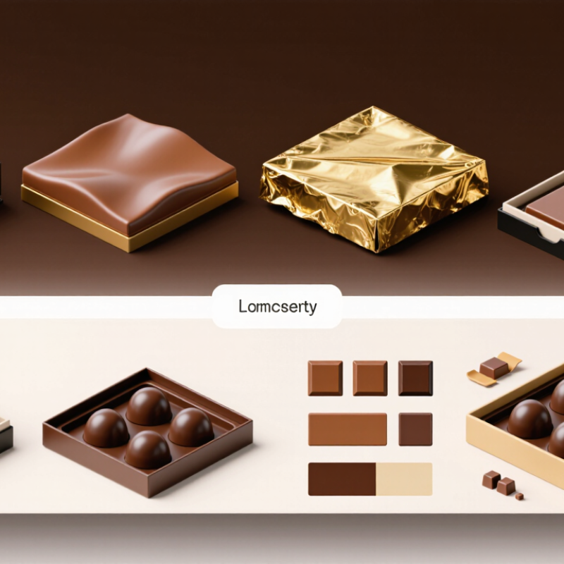
Luxury chocolate is judged before the first bite. A rigid box, soft-touch paper, and precise foil can suggest care instantly. Yet elegance is not decoration alone. It protects texture, controls presentation, and supports a memorable brand experience.
This guide explores seven practical tips for designing Luxury Chocolate Confectionery Packaging Boxes. The advice reflects real packaging considerations, including material selection, structural testing, color control, and finishing. Experienced teams check board strength, food-contact suitability, closure performance, and transport risks before production approval. Small details matter. A lid that lifts smoothly feels intentional. A tray that keeps each praline aligned prevents disappointing movement. Clear product information also helps customers make confident choices.
Luxury must remain useful. Excessive layers may look impressive, but they can increase waste and frustrate opening. I have seen beautiful prototypes fail because corners scuffed during shipping or ribbons loosened after repeated handling. That lesson deserves attention. The most elaborate solution is not always the best. It should balance protection, accessibility, responsible material choices, and visual distinction. The following tips will help brands refine that balance and question weak assumptions. They also encourage practical decisions based on testing, supplier communication, and customer experience. Even small corrections can elevate the final impression. Start with purpose, not glitter.
Luxury chocolate packaging begins with a clear brand definition, not expensive decoration. Decide what the brand should make customers feel: heritage, refinement, warmth, or quiet confidence. A twelve-piece collection may need a different tone from an everyday gift box. The packaging should express that difference immediately.
Set practical objectives before choosing materials. Define the target buyer, selling price, shelf location, shipping conditions, and opening experience. A rigid drawer box can create ceremony, while a magnetic lid may improve speed and usability. Test the box with real chocolate inserts, not empty samples. Check whether pieces move, surfaces scratch, or ribbons loosen during delivery. Small failures matter.
Color, texture, and typography should support the intended position. Deep brown paper with restrained foil can suggest tradition, while soft-touch coating may communicate modern elegance. However, too many finishes can look confused and increase production risk. Less can work better.
A premium box also needs dependable protection, readable product information, and responsible material choices. Confirm supplier specifications and review prototypes under store lighting. The first concept may look impressive on a screen but feel ordinary in hand. That gap deserves honest criticism before production.
7 Tips for Luxury Chocolate Packaging Boxes
Choose dense, food-contact-safe paperboard with a smooth, stable surface. A rigid board protects chocolate from bending, scuffing, and sudden pressure. Check supplier documents for material composition, migration testing, and local food-contact compliance. Do not judge quality by thickness alone. A poorly laminated board may warp in humid storage.
Select finishes that support the product instead of hiding weak construction. Soft-touch coatings create a refined feel, while foil stamping adds controlled brightness. Embossing can make a small emblem feel tactile and memorable. Keep printed areas free from strong odors that could affect delicate chocolate aromas. Test every finish after chilling and handling. Some coatings look perfect at first. Then they crack near the folds.
Build an internal structure around the chocolate’s actual shape. Use fitted trays, paperboard dividers, or molded inserts to limit movement. Leave enough clearance for easy removal, but not enough for pieces to slide. Add a protective sleeve when boxes face repeated transport. For warm climates, consider an insulated layer and clear temperature guidance. I have seen elegant boxes fail because the insert was too loose. That mistake is easy to miss during a showroom review. Drop tests, compression tests, and humidity checks reveal more than appearance alone. Record the results, revise the dieline, and test the finished box again.
| No. | Packaging Focus | Recommended Specification | Relevant Data or Standard | Luxury Benefit | Practical Tip |
|---|---|---|---|---|---|
| 1 | Select a rigid premium board | Use wrapped rigid paperboard for presentation boxes and folding carton board for lightweight retail packs. | Rigid board commonly measures approximately 1.5–3.0 mm in thickness; folding carton board is often about 0.3–0.8 mm, depending on grade. | Creates a substantial hand feel, stable walls, and a clean presentation on shelves or gift tables. | Match board thickness to box size, product weight, and shipping distance instead of choosing the thickest option automatically. |
| 2 | Use food-contact-safe inner materials | Separate chocolate from printed surfaces with food-grade paper cups, trays, inserts, or a sealed inner pouch. | Food-contact packaging should comply with the requirements applicable to its sales market; paper, inks, coatings, and adhesives should be evaluated for intended use. | Protects flavor, appearance, and hygiene while communicating careful product handling. | Request supplier documentation for food-contact suitability and avoid direct chocolate contact with unverified coatings or adhesives. |
| 3 | Add tactile surface finishes | Combine soft-touch or matte lamination with selective gloss varnish, embossing, debossing, or textured paper. | Use no more than two or three contrasting effects on one panel to preserve visual hierarchy and reduce production complexity. | Improves touch, light reflection, and perceived craftsmanship without relying only on metallic decoration. | Place tactile effects on the logo, lid, or key pattern rather than covering every surface. |
| 4 | Choose refined metallic details | Use foil stamping, metallic ink, or metallic paper for borders, lettering, seals, and small decorative areas. | Fine details require adequate line weight and spacing; confirm minimum production tolerances with the printer before final artwork approval. | Adds controlled brilliance and makes important visual elements easier to notice. | Use metallic accents selectively because large foil areas can increase cost and may reduce readability. |
| 5 | Build a protective insert structure | Use a fitted paperboard, molded-pulp, or food-contact plastic insert with individual cavities for each chocolate. | Allow clearance around each piece while preventing lateral movement; cavity dimensions should be based on the product’s actual measured size. | Reduces abrasion, prevents pieces from colliding, and keeps the unboxing arrangement orderly. | Test the insert after vibration, handling, and drop trials using the final chocolate shape and weight. |
| 6 | Design for temperature and moisture protection | Combine a moisture-resistant outer finish with a sealed inner barrier when the product will face humid conditions or extended transport. | Chocolate quality is sensitive to heat, humidity, odor transfer, and temperature fluctuation; packaging performance depends on the full distribution environment. | Helps preserve gloss, snap, aroma, and resistance to surface bloom. | Validate packaging during seasonal shipping conditions instead of relying only on a room-temperature sample review. |
| 7 | Balance sustainability with premium appearance | Prefer recyclable paper-based components, right-sized structures, water-based coatings where suitable, and easily separable materials. | Reduce unnecessary layers and oversized void space; recycling compatibility depends on local collection systems and the final material combination. | Communicates responsible design while maintaining a polished, gift-ready appearance. | Include clear disposal guidance and verify recyclability claims for the exact finished package, not just individual components. |
Note: Final material selection should be confirmed through supplier specifications, food-contact documentation, prototype testing, and distribution-condition trials.
7 Tips for Luxury Chocolate Packaging Boxes
Luxury chocolate packaging should make the opening feel deliberate, not merely expensive. Use seven design choices: tactile paper, restrained color, precise typography, subtle embossing, a memorable emblem, a secure insert, and a useful message. Soft-touch paper can suggest warmth, while a small metallic edge adds controlled contrast. Keep the details quiet.
According to the 2024 Voice of the Consumer Survey, shoppers are willing to pay an average 9.7% more for sustainably produced goods. The 2023 Global Sustainability Study also reported that 78% of consumers consider sustainability important when purchasing. Choose recycled board, compact inserts, and minimal plastic without weakening protection. State these choices clearly on the box. Vague claims feel polished, but they do not feel trustworthy.
Memorable brand details should reward close attention. Print a short origin note beneath the lid. Add a repeated cocoa-pod pattern inside the sleeve. Give each flavor a distinct color, but keep the typography consistent. A perfect box can still feel cold. I would test the unboxing experience with real users, because designers often overvalue appearance. Check whether the lid opens smoothly, the chocolates stay aligned, and the message is readable under warm light. One small flaw may matter more than an expensive finish. Packaging should feel personal, durable, and honest.
Luxury chocolate packaging should make the product easy to reach, not difficult to admire. Choose rigid board with reinforced corners to prevent crushed edges during delivery. Add a pull ribbon or smooth drawer opening for controlled access. Avoid tight lids that require excessive force. Small details matter.
Arrange each chocolate in a visible, stable cavity. A shallow tray helps customers identify flavors without touching every piece. Use food-safe inserts that separate pieces and reduce movement. Include a clear flavor guide inside the lid. It supports confident selection, especially when fillings look similar. The layout should feel generous, but empty space can cause pieces to slide.
Chocolate also needs practical protection. Select an inner barrier that limits moisture, odors, and light exposure. Keep the chocolate away from direct contact with decorative inks, adhesives, or rough materials. For warmer delivery conditions, test insulation and temperature-sensitive components before production. Packaging should protect the surface, snap, and aroma. It is not a perfect science. I have seen attractive boxes fail because the insert shifted during transport. Test the full unboxing process with real users, including opening, choosing, and resealing the box. Check the package after vibration, stacking, and temperature changes. Revise anything that feels awkward. A luxury box earns trust when beauty supports access and preservation.
These practical design targets show how luxury chocolate packaging can improve unboxing, product access, and preservation while creating a more refined customer experience.
The benchmark scores represent recommended design priorities on a 100-point scale. Preservation targets reflect commonly used chocolate-storage practices: cool temperatures, low humidity, limited light, and protection from odor transfer.
Balance Sustainability, Production Quality, and Cost Control
Select recycled or responsibly sourced paperboard with verified material documentation. Elegant texture should not hide weak compression strength.
Reduce unnecessary layers. A rigid box, paper sleeve, and molded insert may look impressive, but they increase waste and labor. Keep it simple.
Match the structure to the chocolate’s weight, shape, and shipping distance. Lightweight bonbons need different protection from dense chocolate bars.
Choose water-based coatings where suitable, and confirm drying performance before approving mass production.
Build a physical prototype before finalizing artwork. Check the lid fit, corner alignment, insert movement, and opening experience by hand. Test before scaling.
Control costs through modular dimensions and shared components, not by removing essential protection. Standard board sizes can reduce cutting waste and setup charges.
Ask the packaging supplier for compression, rub, and humidity testing. These checks reveal problems that attractive digital renders cannot show.
Production teams often find that a small design change prevents large rework costs. A perfect zero-waste package is not always realistic, especially for delicate products. However, transparent trade-offs make decisions more reliable.
One overlooked detail is storage: glossy surfaces may show fingerprints, while textured papers can collect dust. Review samples under retail lighting, during packing, and after transport simulation. Some compromises will remain. That is where careful documentation matters.
Choose dense, food-contact-safe paperboard with a smooth, stable surface. Rigid board resists bending and crushed edges. Thickness alone proves little. Check composition, migration testing, and local compliance documents.
Soft-touch coatings create a refined feel. Foil stamping adds controlled brightness. Embossing makes small details tactile. Test every finish after chilling and folding. Some coatings crack later.
Build the insert around each chocolate’s actual shape. Use fitted trays, dividers, or molded cavities. Leave enough room for easy removal. Do not leave enough space for sliding. Loose inserts can ruin an elegant presentation.
Use reinforced corners and controlled openings. A pull ribbon or smooth drawer can help. Avoid lids requiring excessive force. The box should open calmly, not fight the customer.
Place each piece in a visible, stable cavity. A shallow tray helps customers identify flavors. Add a clear flavor guide inside the lid. Empty space looks generous, but it may increase movement.
Use an inner barrier against moisture, odors, and light. Keep chocolate away from inks, adhesives, and rough surfaces. Test insulation for warm deliveries. Protect the surface, snap, and aroma.
Build a physical prototype before approving artwork. Check lid fit, corner alignment, and insert movement by hand. Run drop, compression, vibration, stacking, and humidity tests. Digital renders miss uncomfortable details.
Use recycled or responsibly sourced paperboard with verified documentation. Reduce unnecessary layers and decorative materials. Choose modular dimensions to limit cutting waste. Do not remove protection just to lower cost.
Review samples during packing, storage, and transport simulation. Glossy surfaces show fingerprints. Textured papers may collect dust. Water-based coatings can require drying checks. Some compromises remain, and that needs honest documentation.
Luxury Chocolate Confectionery Packaging Boxes should do more than protect delicate chocolates; they should communicate the character and value of the product from the first glance. Begin by defining the brand’s positioning, target customers, and packaging objectives, then select premium materials, refined finishes, and protective structures suited to the chocolate’s shape and sensitivity. Thoughtful use of color, typography, texture, and distinctive details can create an elegant visual identity that customers remember.
The unboxing experience should be smooth, attractive, and practical, with easy product access and secure internal organization. Packaging should also help preserve freshness by considering barriers against moisture, light, heat, and movement during transport. At the same time, responsible material choices, efficient production methods, consistent quality control, and realistic cost planning are essential. By balancing luxury, functionality, sustainability, and operational efficiency, the packaging can enhance customer satisfaction while supporting long-term product value.